So like usual, I couldn't decide what romance book to feature on the coveted Valentine's Day; so I decided not to feature one book over the rest. Instead I thought it would be fun to have a chat about what cover features attract me to romance novels. As we all know, 'never judge a book by the cover' but admit it, we all are attracted by the cover. It is often us reader's first impression. That color or font that attracts us from across the room, draws the eye in the bookstore or library, or when scrolling the endless pages of books online. Today I wanted to talk about what makes me stop and pick up different romance books. We also know that romance books have had some not so great cover choices in the past, but they have certainly come a long way.
There are several things that will make me pick a book to read more (or if I am in a rush or on a shopping spree just pick it up without knowing anything), but first let's talk about the title and font. I prefer romance books with a catchy title, or a play on words but prefer that it not be super outright with words like 'Love' or 'Heat' in the title. A couple of my favorite titles are . . .
They are fun and quirky but clearly give the romance vibe (I highly recommend checking out the titles of the Maple Leaf Series, there are a lot of fun ones in it).
As far as font, I like when the title (and author) blend into the cover image a bit, not overly bold or bright, I also prefer the font not to be overly embellished (unless of course the title is a little risque on its own, then embellish like crazy so it is not easily seen from a distance when I am waiting in the school pick up line at my son's Catholic school!). I love the style of these titles . . .
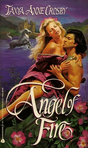
Now shall we talk about the main event?! The image itself, which of course often features the hero and heroine. Poor romance got a bit of a bad rap for the slightly tacky covers, not saying that any of those books are bad, I have certainly loved several but honestly not the type of cover I want on my shelves or to read in public places. You know the ones I mean . . .
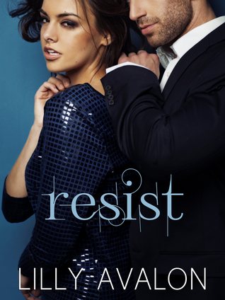
(note these are all on my bookshelves still) Some of you might like that they make their subject matter very clear. And I am okay with hero and heroine's gracing my covers, but I just prefer a little more subtly. I admit that a shirtless hunk is perfectly fine for me, but I prefer back and shoulder's to be shown like on
Tattoos are a definite plus for me. Also, shirts don't need to be missing for it to catch my eye . . .
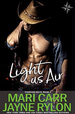
Give me a cowboy and the deal is signed . .
or add a dog to the cover and I will pick it up every time . . .
(I haven't run into any with a kitten yet, but better believe I will buy it no questions asked). We don't always need the hero either, I particularly like seeing my strong leading ladies on the covers looking as badass as they should be . . .
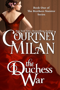
or if it is historical, I love to see the dresses like . .
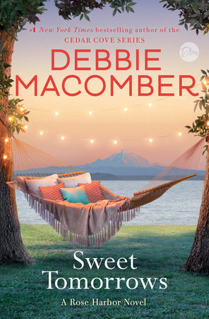
Another option that I like is to give me an idea of the setting or set the mood for the book, some of my favorites are from Debbie Macomber
So those are the elements that catch my eye with romance books. Do any of these same features attract your attention? What do you look for in your romance covers?
If you liked this post let me know and I will continue with a series of cover attraction posts ;)











I'll admit that I'm not much of a romance reader, and for some reason romance covers actually often make me avoid a book that I might have otherwise enjoyed. I can't quite figure that out, except that those covers with half-naked people make me a little uncomfortable (I guess) and the setting ones feel a little too "sweet" to me. But that's not to knock the stories inside because I actually DO enjoy romances when I pick one up---I'm just not drawn to them the way I am some other genres (like fantasy). I'm glad you've found the books that draw you in and are perfect for you!
ReplyDeleteNicole @ Feed Your Fiction Addiction
I get that often Romance covers can be off-putting, especially if you read in public a lot; so many people judge readers of romance. It is funny, you put an animal on any genre of book and I am almost guaranteed to pick it up, same with something stabby. It is fun to really look at what draws us into a book before reading the synopsis. I haven't gone and just browsed shelves in a long time, I am so used to knowing exactly what books I want to pick up before going to a bookstore. Maybe soon I will let the covers guide me to a new read soon.
DeleteNow I need a cover with a buff tattooed alpha hero with a cute tiny kitten perched on his shoulder... MAKE IT SO!
ReplyDelete